
Dear all,
I suggest to change a stock Redmine theme to something more beautiful, for example gitmike: https://github.com/makotokw/redmine-theme-gitmike which used by srlabs.de and looks like pretty. Furthermore, the Osmocom logo will look better on light background.
Opinions?
С наилучшими пожеланиями, Яницкий Вадим.

On Mon, Feb 29, 2016 at 10:17:43AM +0600, Вадим Яницкий wrote:
I suggest to change a stock Redmine theme to something more beautiful, for example gitmike: https://github.com/makotokw/redmine-theme-gitmike
+0.5 for using a different theme. gitmike does look slick but IMHO tends to have not enough contrast. And whether we want to look like github of all things is a bikeshed, too ;)
~Neels

On 29 Feb 2016, at 10:21, Neels Hofmeyr nhofmeyr@sysmocom.de wrote:
On Mon, Feb 29, 2016 at 10:17:43AM +0600, Вадим Яницкий wrote:
I suggest to change a stock Redmine theme to something more beautiful, for example gitmike: https://github.com/makotokw/redmine-theme-gitmike
+0.5 for using a different theme. gitmike does look slick but IMHO tends to have not enough contrast. And whether we want to look like github of all things is a bikeshed, too ;)
https://github.com/openSUSE-Team/redmine-bentoish and https://progress.opensuse.org for an installation/preview. They load the logo through a CSS rule to match on the h1/header...
holger
On Fri, Mar 04, 2016 at 10:53:33PM +0100, Holger Freyther wrote:
https://github.com/openSUSE-Team/redmine-bentoish and https://progress.opensuse.org for an installation/preview. They load the logo through a CSS rule to match on the h1/header...
For me this has the same quirk of not enough contrast. There I prefer the redmine theme, it has a near black font on the white background: common sensical design choice ... IMHO #808080-on-white is plain stupid.
I could clone the theme and modify the font color for contrast, and then I'd be fine with any of the two themes suggested (github or opensuse).
For opensuse this would probably suffice: [[[ table.list tr.issue a { color: #000; } span.description, #search-results dd span.description { color: #000; } ]]]
And while at it I'd enlarge the font just a tad, but here I'm certainly drifting into deep bikeshed lands again.
~Neels
On 07 Mar 2016, at 11:30, Neels Hofmeyr nhofmeyr@sysmocom.de wrote:
For opensuse this would probably suffice: [[[ table.list tr.issue a { color: #000; } span.description, #search-results dd span.description { color: #000; } ]]]
the first i could modify.. the second I added.. does it look right now?

On Mon, Feb 29, 2016 at 10:21:13AM +0100, Neels Hofmeyr wrote:
On Mon, Feb 29, 2016 at 10:17:43AM +0600, Вадим Яницкий wrote:
I suggest to change a stock Redmine theme to something more beautiful, for example gitmike: https://github.com/makotokw/redmine-theme-gitmike
+0.5 for using a different theme. gitmike does look slick but IMHO tends to have not enough contrast. And whether we want to look like github of all things is a bikeshed, too ;)
Also, if you replace the small square logo with the osmocom logo, that logo ends up overlapping the entire menu bar. So even the 'gitmike' theme is not really suited for adding a logo on the left hand side :/
I have tried to replace the logo using srlabs.de site as workground (just for example). I don't know how to make the search bar look fine, so I removed it. But I think it's possible.
Changes #header { background-image: url("http://projects.osmocom.org/images/osmocom_logo.png "); background-repeat: no-repeat; background-position: 20px 10px; }
See attachment.
С наилучшими пожеланиями, Яницкий Вадим.
2016-03-05 10:35 GMT+06:00 Harald Welte laforge@gnumonks.org:
On Mon, Feb 29, 2016 at 10:21:13AM +0100, Neels Hofmeyr wrote:
On Mon, Feb 29, 2016 at 10:17:43AM +0600, Вадим Яницкий wrote:
I suggest to change a stock Redmine theme to something more beautiful, for example gitmike: https://github.com/makotokw/redmine-theme-gitmike
+0.5 for using a different theme. gitmike does look slick but IMHO tends to have not enough contrast. And whether we want to look like github of all things is a bikeshed, too ;)
Also, if you replace the small square logo with the osmocom logo, that logo ends up overlapping the entire menu bar. So even the 'gitmike' theme is not really suited for adding a logo on the left hand side :/
--
- Harald Welte laforge@gnumonks.org
============================================================================ "Privacy in residential applications is a desirable marketing option." (ETSI EN 300 175-7 Ch. A6)

Also, if you replace the small square logo with the osmocom logo, that logo ends up overlapping the entire menu bar. So even the 'gitmike' theme is not really suited for adding a logo on the left hand side :/
Adjusting the padding works fine :
padding: 85px 0px 0px 20px;
gives
http://i.imgur.com/Uwd0EZf.png
Cheers,
Sylvain
On 05 Mar 2016, at 07:34, Sylvain Munaut 246tnt@gmail.com wrote:
Also, if you replace the small square logo with the osmocom logo, that logo ends up overlapping the entire menu bar. So even the 'gitmike' theme is not really suited for adding a logo on the left hand side :/
Adjusting the padding works fine :
padding: 85px 0px 0px 20px;
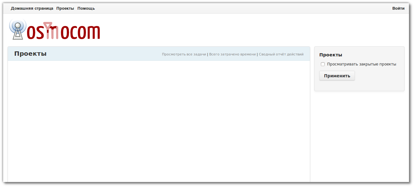
thanks! I enabled it. At least it looks a bit different than the standard theme. What do you guys think? Not sure I like the SUSE green and the box alignment could be better :)
holger
baseband-devel@lists.osmocom.org
-
 Harald Welte
 -
 Holger Freyther
 -
 Neels Hofmeyr
 -
 Sylvain Munaut
 -
 Вадим Яницкий